
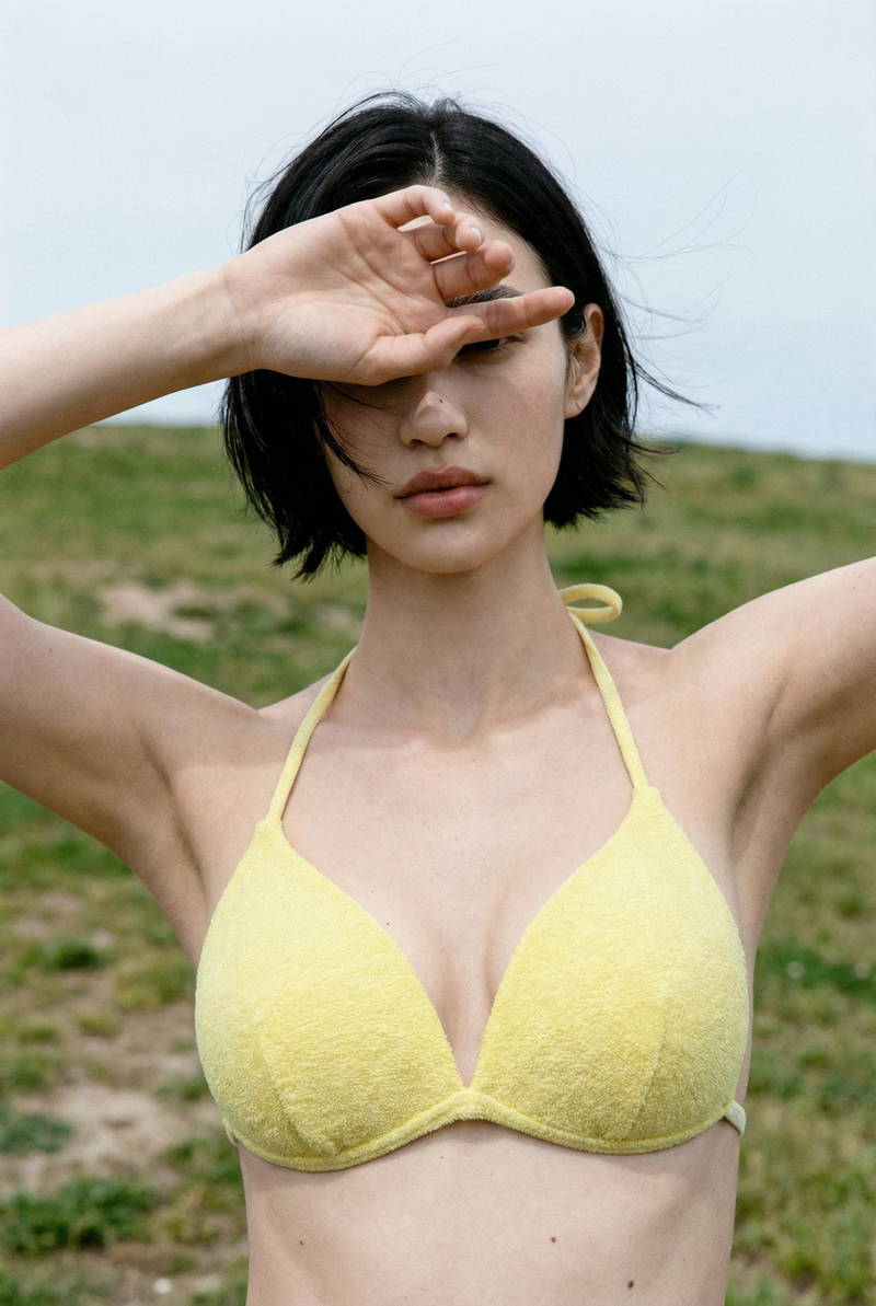
I used to be so confused about why some swimsuits made me look amazing while others just made me feel like a giant walking piece of wallpaper. To be honest I used to think that as long as the print was cute it didn't really matter what the shape was but boy was I wrong. I once bought this super expensive one piece with massive hibiscus flowers all over it and when I saw the photos later I looked like I had grown five inches in width overnight. It was such a bummer because the suit itself was beautiful but it just didn't work with my frame at all. Since then I have spent way too much time experimenting with different prints and I finally figured out that there is a huge visual difference between big floral splashes and those sharp geometric lines. It is basically all about how your eyes move across the fabric and once you get the hang of it you can actually use patterns to hide the bits you don't like and highlight the parts you do.
The trap of those oversized floral prints
Large scale prints are definitely a vibe but they can be really tricky if you are not careful. When you have these huge flowers or big abstract shapes they tend to act like a giant magnifying glass for whatever part of the body they are sitting on. If you have a smaller frame these big patterns can totally swallow you up and make you look even shorter than you are. On the other hand if you are more curvy those big prints can sometimes make everything look a bit broader because the eye just stops at every big flower. I usually suggest staying away from giant prints right on your midsection if you want a more streamlined look because they just draw so much attention to that one specific spot.
Why geometric patterns are basically a cheat code
Geometric prints are honestly like the secret weapon of the swimwear world because they are so much more predictable. Since they use clean lines and repeating shapes like triangles or diamonds they create a sense of structure that florals just don't have. I love using vertical stripes or chevrons because they naturally pull the eye up and down which makes you look way taller and leaner. Even something like a small grid pattern can help to smooth things out because it gives the eye a consistent path to follow. It is way less chaotic than a busy tropical print and it usually looks a lot more high end and modern too.
Mixing things up to balance your proportions
If you are like me and you have a body that isn't perfectly symmetrical then you can actually use these two different types of patterns together. For example if you want to add a bit of volume to your chest but keep your hips looking slim you could go for a big bold floral top paired with a solid or a subtle geometric bottom. This works because the big print adds visual weight to your top half while the cleaner lines on the bottom keep things grounded. It is such an easy way to play with your proportions without having to wear something super uncomfortable or restrictive. I’ve started looking for suits that already have this kind of mixed media look because it saves me the trouble of trying to match two different pieces myself.
Small scale prints are your best friend for a subtle look
If you aren't really a fan of loud patterns then you should definitely look into ditsy florals or tiny repeating geometrics. These are basically the "neutrals" of the pattern world because from a distance they almost look like a solid color. Because the shapes are so small the eye doesn't get stuck on any one part of your body so it just glides right over everything. It is a much softer look and it is way more forgiving if you are worried about lines or bumps showing through the fabric. I always reach for these when I am feeling a bit bloated or just want a more relaxed and understated energy at the beach.
Pay attention to where the lines actually go
The most important thing I learned is that it isn't just about the pattern itself but where it actually sits on your body. Even the best geometric print can look weird if the lines are angled in a way that cuts you off at the wrong spot. I always check to see if the patterns are symmetrical across the seams because if they are lopsided it can make your whole body look a bit tilted. It sounds like such a nitpicky thing but it really makes a difference in how polished you look. Before you rip the tags off just take a quick walk in front of a mirror and see if the lines are working with your curves or fighting against them.
0 comments